
Werkhuys–Branding
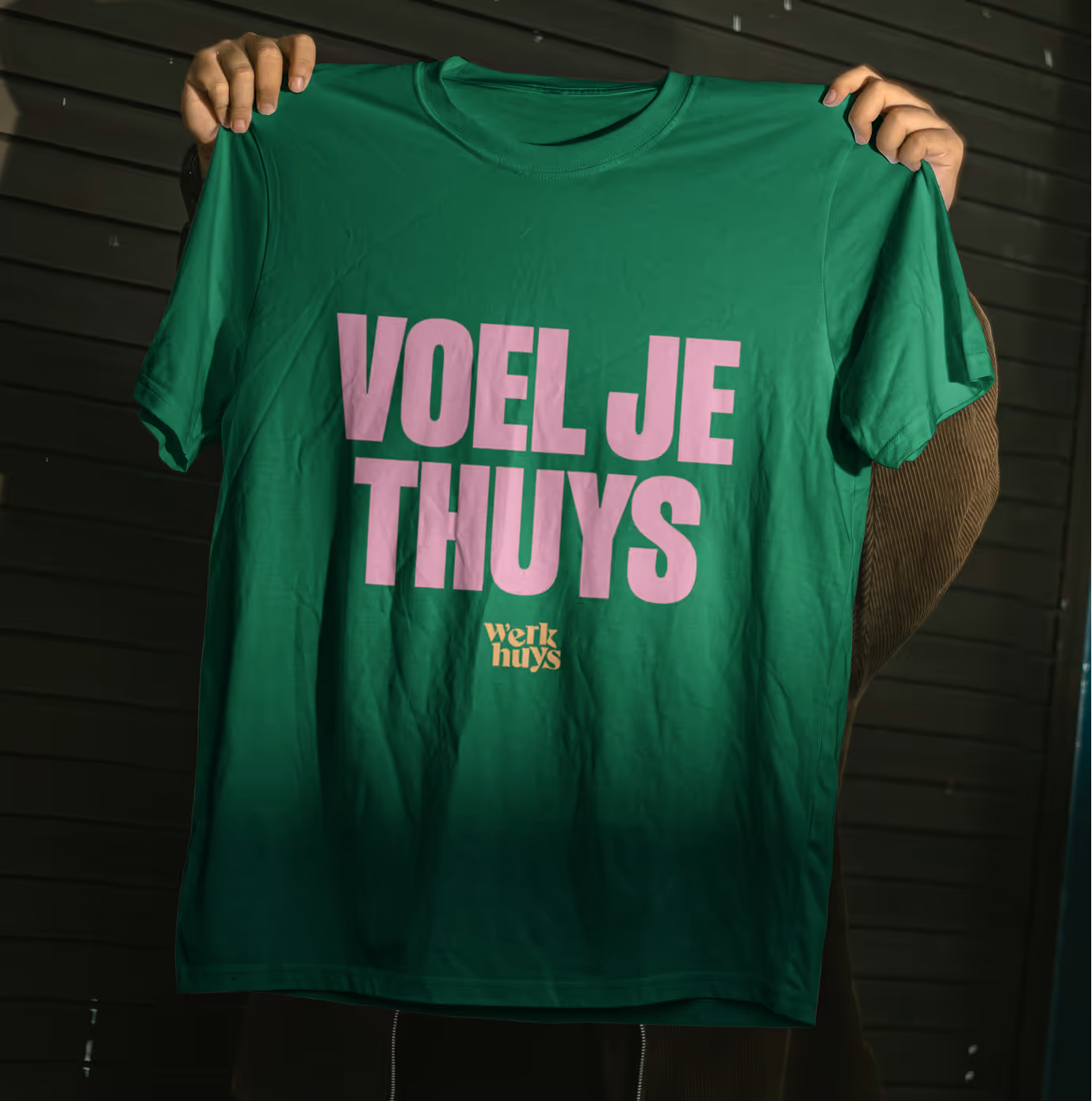
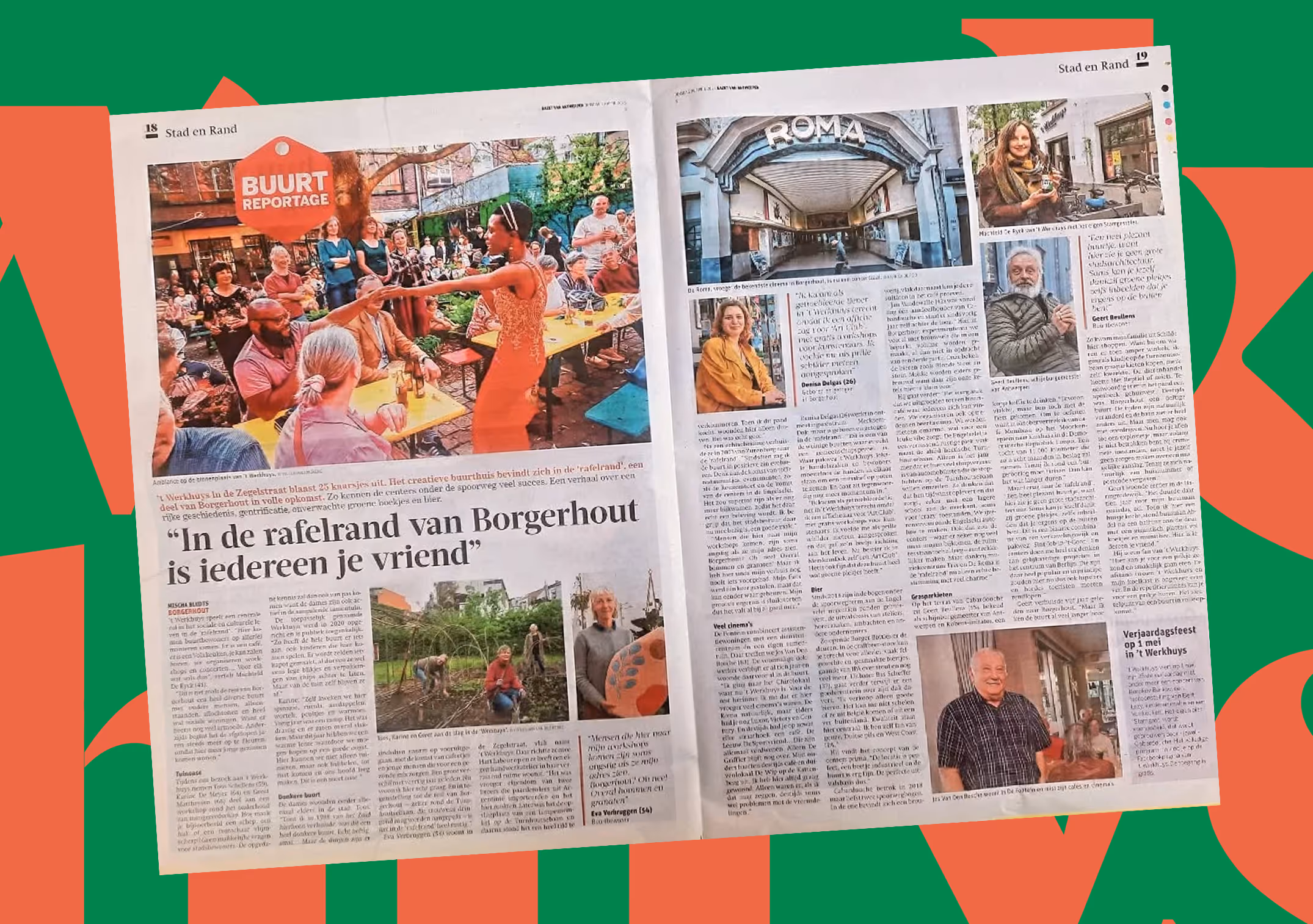
Werkhuys is an open house, nurturing culture and meaningful connections for and by the community of Borgerhout. They literally (and metaphorically) create space in the heart of the city and offer opportunities for cross-pollination between people, talent and organizations. For the last 25 years, they’ve been a cozy oasis for creatives and locals alike.
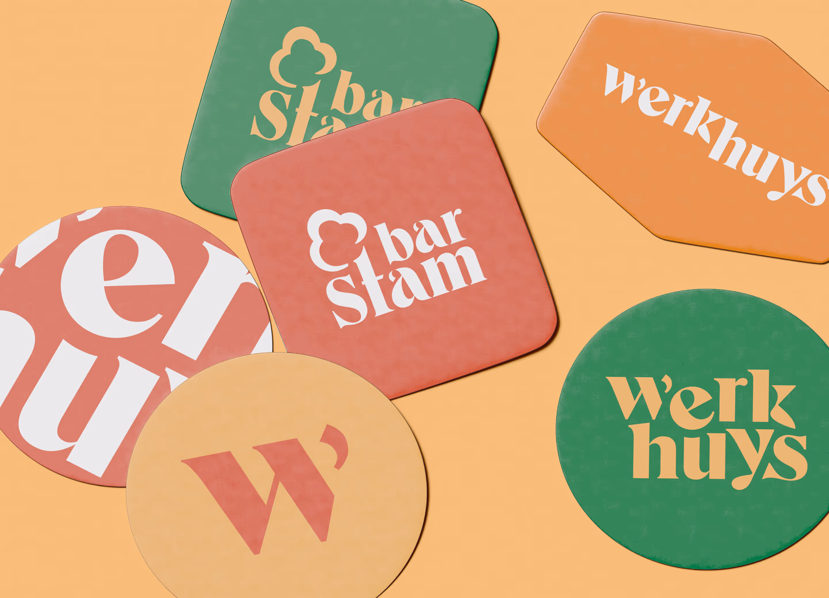
A quarter of a century has passed since Werkhuys was founded. The time was right for a new logo. Their brand-new emblem had to feel accessible, inclusive and welcoming. It needed to have the right cultural sensibility and – above all – avoid pretentiousness.
Our design emphasizes dialogue with a playful edge that captures the welcoming tone of Werkhuys. Dialogue is the recurring motif within the entire Werkhuys organization: this is a place where locals share banter at the bar, great (and small) philosophers meet, lessons are learned, ideas are born and laughter echoes through the days and evenings. During the official presentation of the logo, we could feel the spirit of warmth and collaboration that defines Werkhuys. This is a place where the neighborhood and all of its cultural initiatives meet in a natural, effortless way. The warm color palette of the logo blends in seamlessly with the heartfelt kindness of the staff and volunteers welcoming all visitors. A house full of life, stories and encounters, firmly rooted in the cultural heart of Borgerhout.
A selection of our projects


Thank you!
We received your form and will be in touch soon!
Have a look at our work in the meantime.